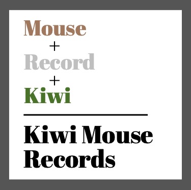
Kiwi Mouse Records Logo
Part of the Graphic Design Collection

Introduction:
I embarked on the creative journey of designing a logo for a new music store known as Kiwi Mouse Records. With a desire to test my imagination and create something unique, I aimed to combine two seemingly unrelated elements – a mouse and a kiwi – and distill them into a visually striking and memorable logo.
- The Logo -
The left side of the slider shows the logic behind the logo and the right side shows the finalized logo design.
My Work:
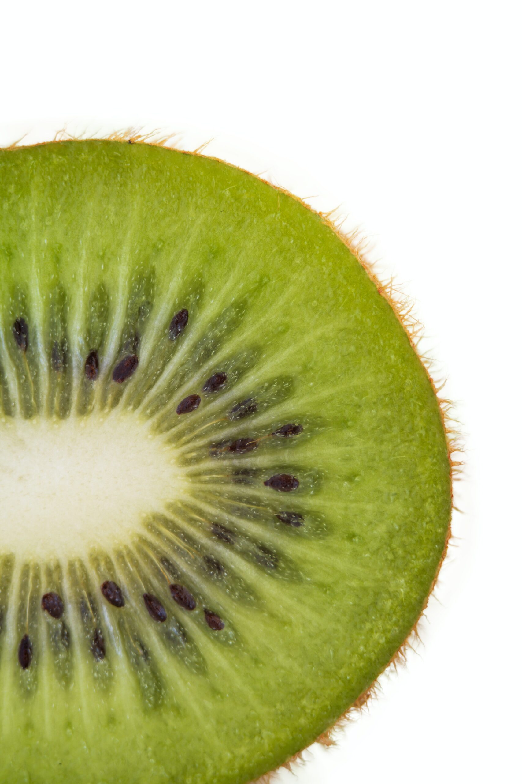
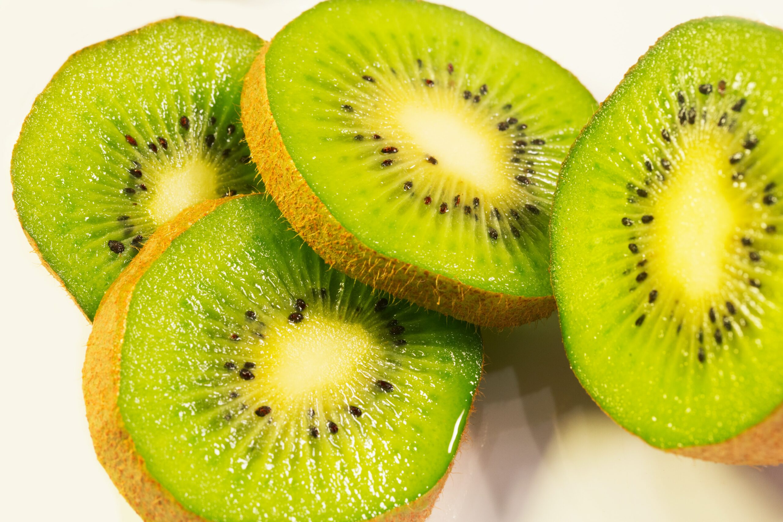
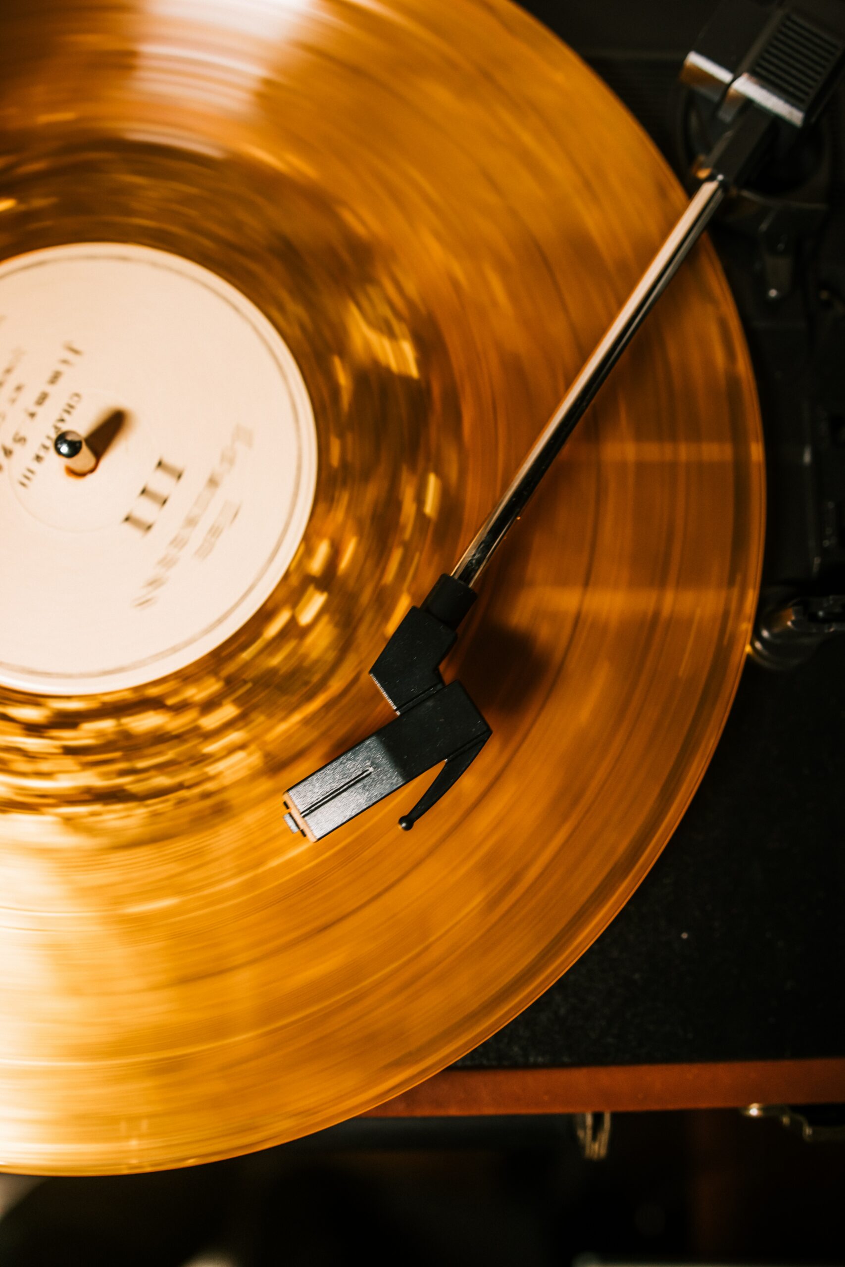
Drawing inspiration from the circular motifs found in the natural design of both a kiwi and a mouse, I sought to leverage this repetitive shape to create a cohesive and harmonious logo. The logo features a circular shape that is split horizontally into two halves. The top half represents a record, complete with distinctive features such as ears, a tail, and eyes, resembling a playful and friendly mouse. The bottom half showcases the texture and vibrant colors of a kiwi, adding a touch of nature and uniqueness to the logo.


Brainstorming
During the logo design process, I immersed myself in a collection of images to spark inspiration and ignite my creativity, allowing me to delve deep into the visual elements that resonated with the brand's identity.
By combining these contrasting elements of nature and music, the Kiwi Mouse Records logo captures the essence of the brand. The circular design alludes to the endless loop of music and the cyclical nature of life, while the inclusion of the kiwi highlights the brand's commitment to sustainability and eco-consciousness. It positions Kiwi Mouse Records as a haven for music enthusiasts, where they can discover both popular hits and rare musical gems in an environmentally conscious manner.
The logo's clever fusion of a kiwi and a mouse serves as a visual representation of the brand's distinctiveness and creative spirit. It conveys a sense of playfulness, inviting customers to explore the world of music in a fun and engaging way.
On the basis of the principles of graphic design, I considered the logo's scalability and versatility, ensuring it can be easily applied to various mediums such as signage, merchandise, digital platforms, and more. The choice of colors and typography was carefully selected to complement the logo, evoking a sense of energy, vibrancy, and friendliness.
In summary, the Kiwi Mouse Records logo embodies the brand's commitment to sustainability, unique music offerings, and creative expression. It serves as a visual symbol that captures attention, sparks curiosity, and invites customers to embark on a musical journey like no other.
Selected Works

Currently CampaignIntegrated Media Campaign

Vans CampaignIntegrated Media Campaign
Betty Crocker CampaignIntegrated Media Campaign

Ablaze Magazine CampaignIntegrated Media Campaign

Indeed CampaignIntegrated Media Campaign
Kiwi Mouse Records LogoGraphic Design

Ablaze Magazine LogoGraphic Design

Resort & Cruise Haute CoutureSocial Media

Thanksgiving FashionSocial Media

How to Shop & Style Petite FashionSocial Media

Coronation FashionSocial Media

The Stylists Behind Celeb FashionSocial Media

French Food in KnoxvilleWriting

Letter From The EditorWriting


Futuristic Fashion ShootPhotography & Videography

Pieces of the World CollagePhotography & Videography

Up-and-Coming Journalist ProfilePhotography & Videography

Disney+ Situation AnalysisResearch
Disney+ Final BookResearch
Contact
Sydney Burzynski
Email: sydneyburzynski@gmail.com
LinkedIn: www.linkedin.com/in/SydneyBurzynski
LinkTr.ee: linktr.ee/SydneyBurzynski
© Sydney Burzynski 2025
My Portfolio