Currently Campaign

Part of the Integrated Media Collection

Currently

Introduction:

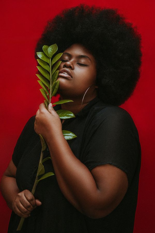
I was given the task to develop a brand identity for an existing company that does not have an established style guide or clear identification. The company that I chose to further develop was Currently – a size-inclusive and sustainable fashion brand.

- Project Contents -

My Work:

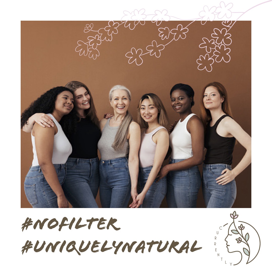
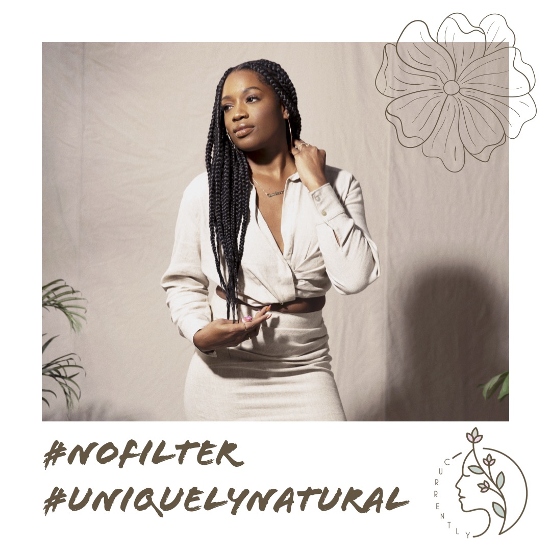
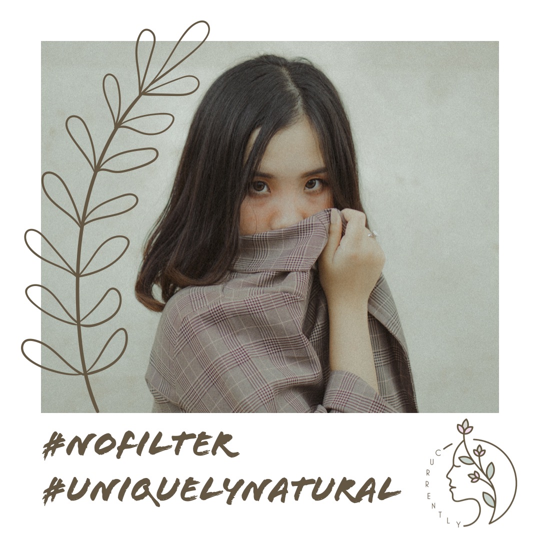
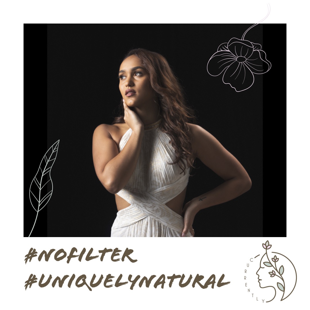
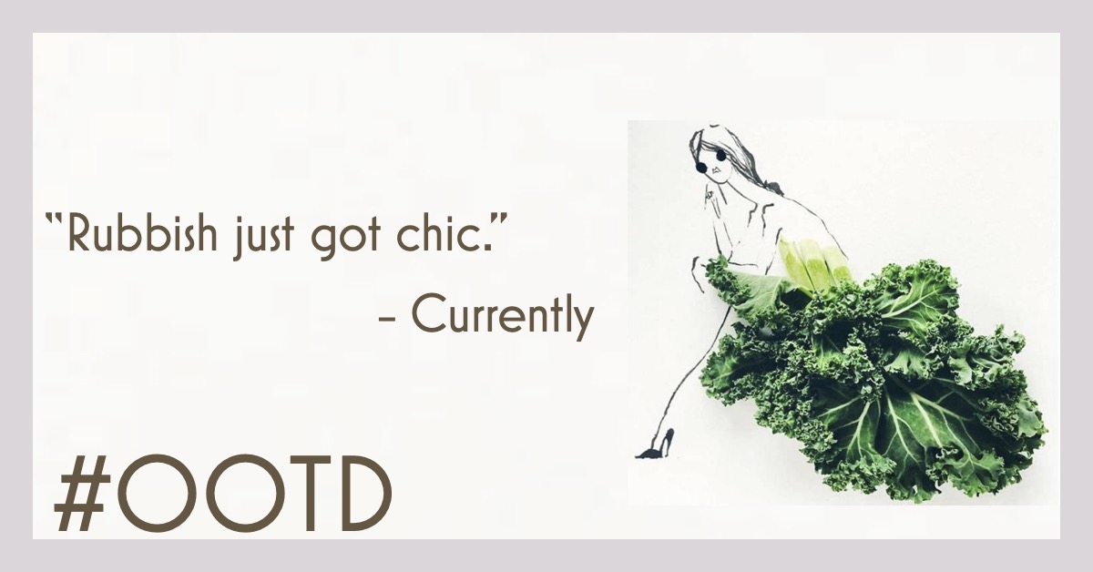
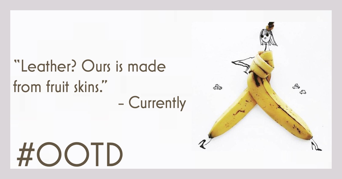
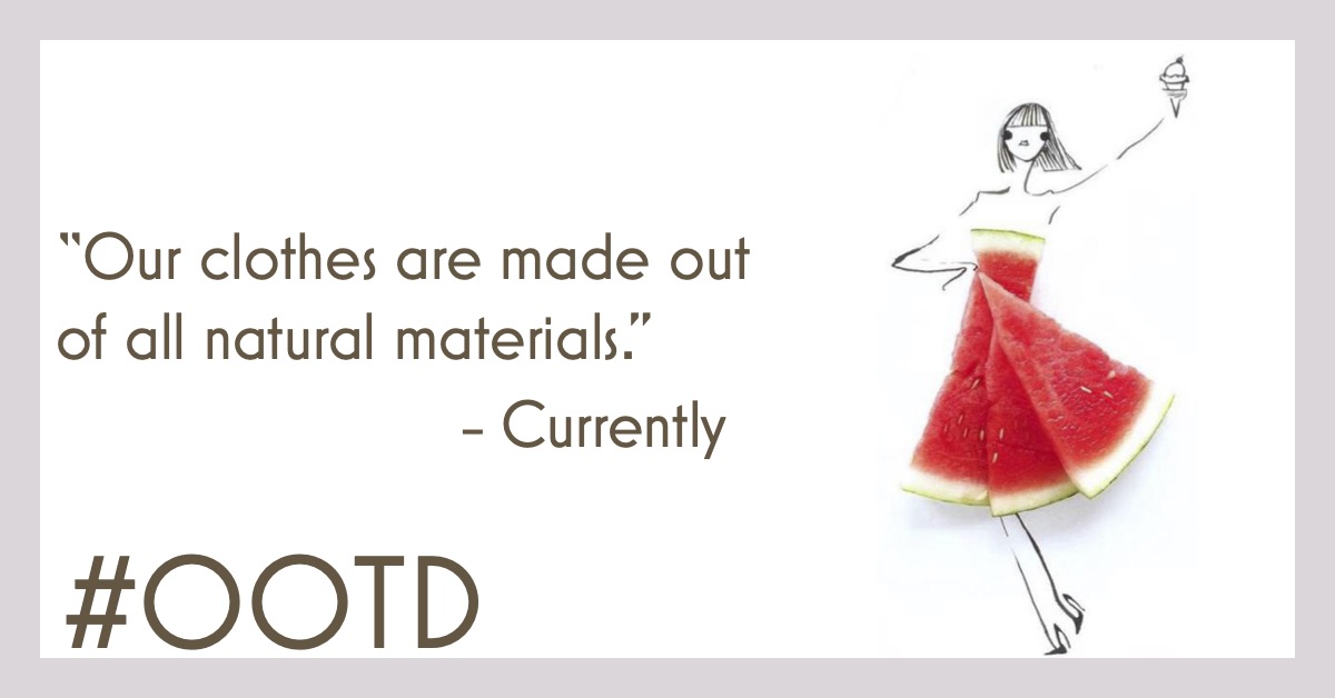
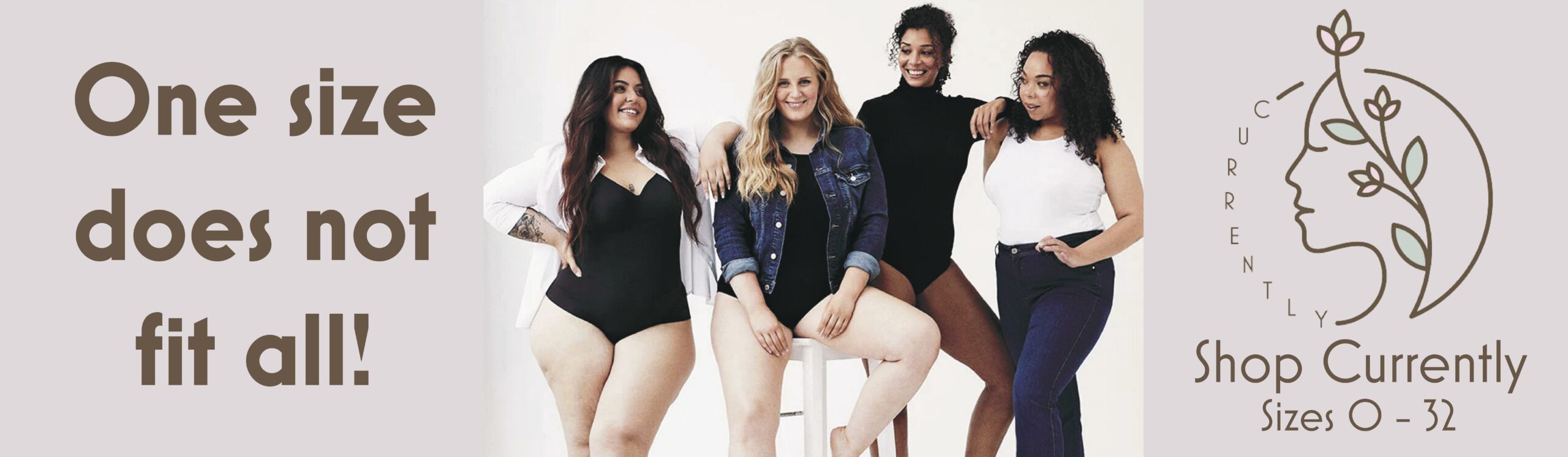
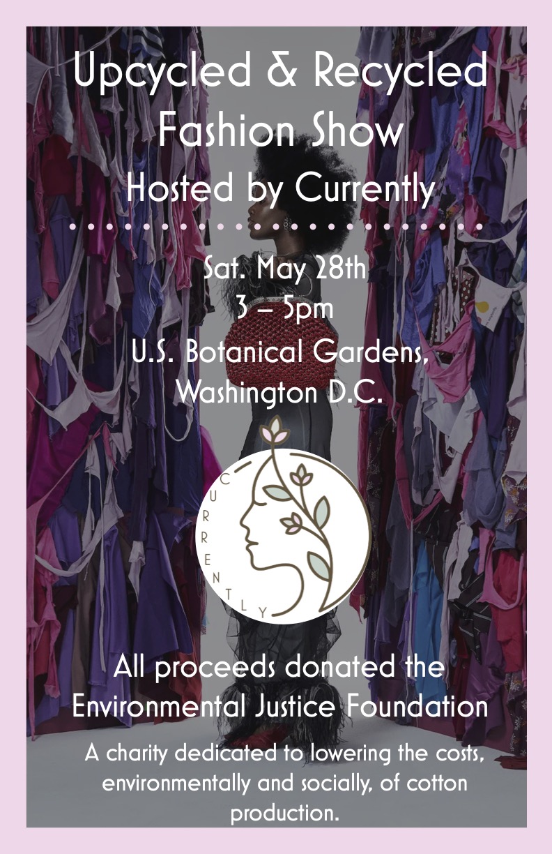
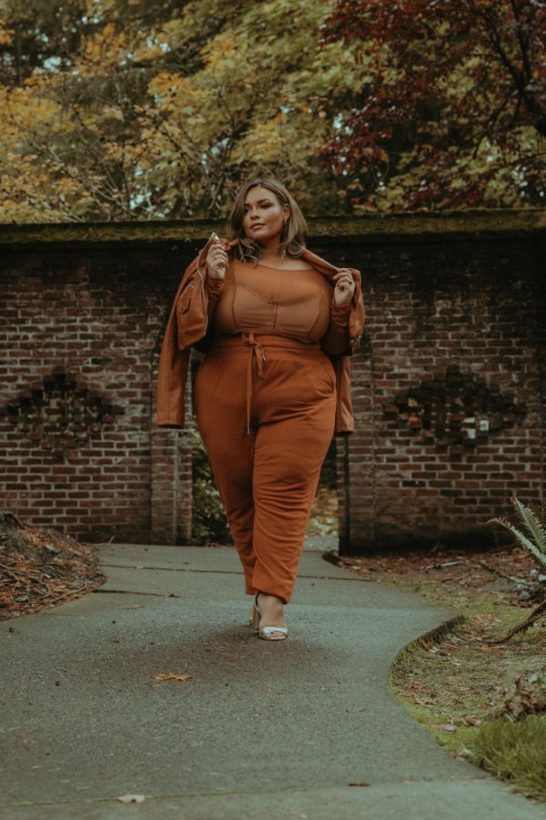
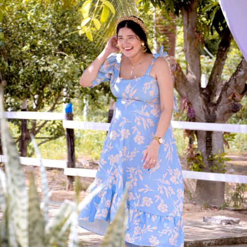
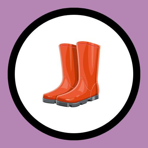
Here is a rebranding campaign whose goal was to develop a distinct brand identity for Currently, a size-inclusive and sustainable fashion brand. Tasked with creating a cohesive and impactful visual identity, I delved into the essence of the brand and its values to establish a compelling and recognizable presence in the market.

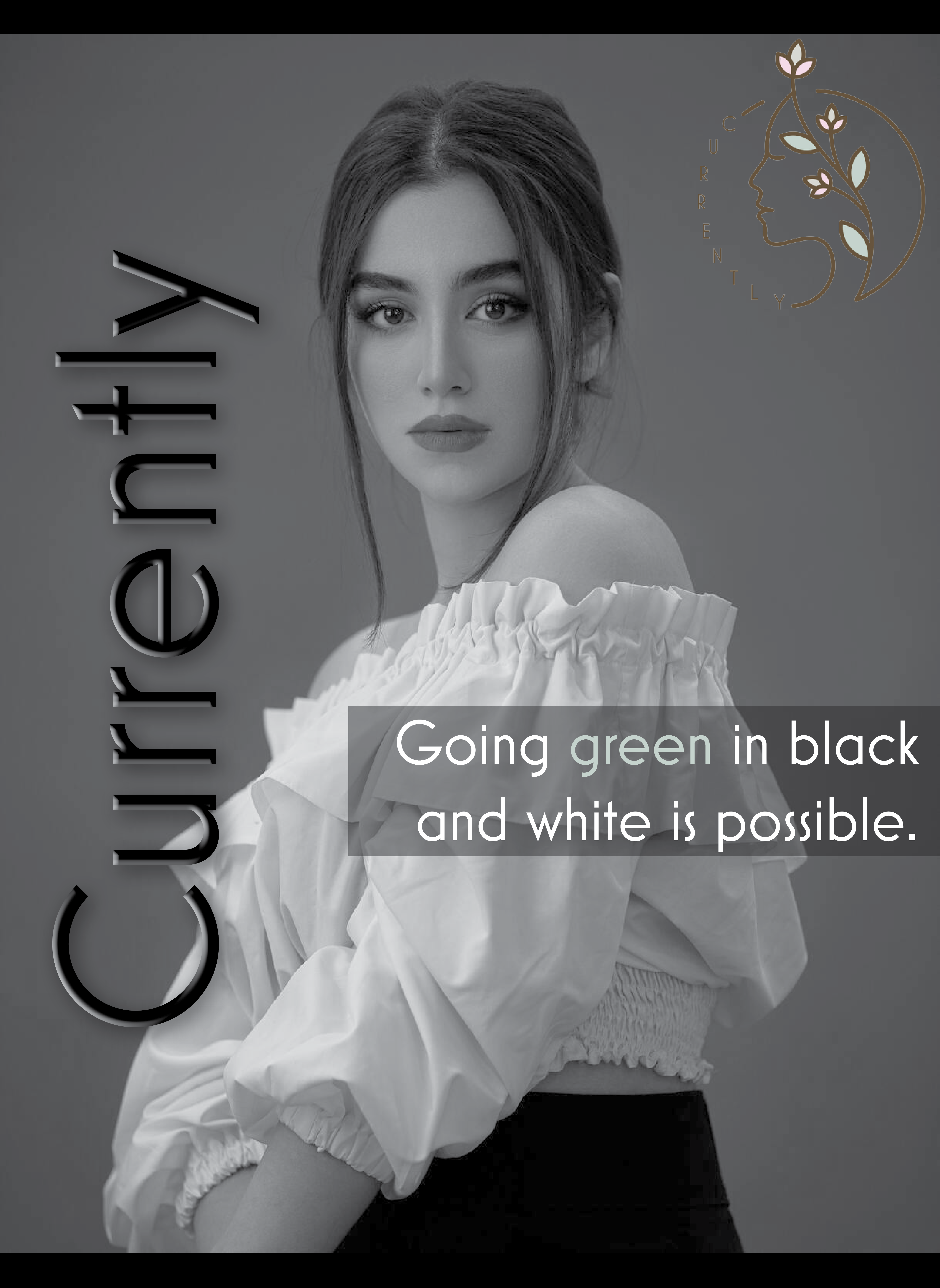
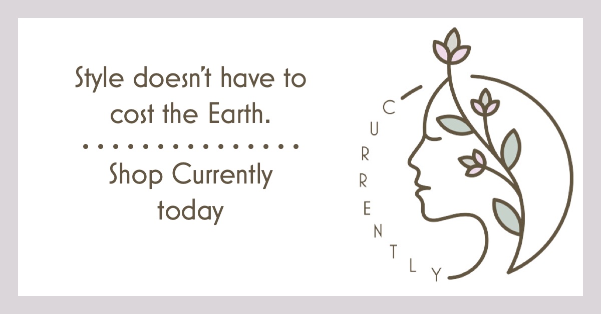
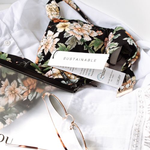
While the name "Currently" aligned well with the brand's purpose and philosophy, it lacked a clear visual representation. To address this, I designed a new logo that would embody the brand's core values and leave a lasting impression. The logo mark combines the figure of a woman with natural elements, specifically flowers. This fusion represents the brand's commitment to embracing natural beauty and celebrating diversity in all its forms. The incorporation of natural colors, including gray, pink, green, and brown, reinforces the brand's connection to the environment and sustainability.

Palm1
Palm3-1
Palm2-1

To complement the logo and create a cohesive visual language, I carefully selected typography that strikes a balance between tradition and modernity. By combining serif and sans-serif fonts, I captured the brand's blend of heritage and innovation, paying homage to its roots while signaling a bright and progressive future.

In addition to visual elements, I crafted brand values and established a distinct tone of voice that resonates with Currently's target audience. Sustainability and inclusivity formed the foundation of these brand pillars, ensuring that every communication and interaction with customers reflects these core principles.

Tree4
Tree3

To maintain consistency across all brand touchpoints, I developed a comprehensive style guide that outlined the proper usage of the logo, typography, colors, and other visual elements. This style guide serves as a blueprint for the brand's visual identity, empowering internal teams and external partners to maintain a cohesive and consistent brand image.

Throughout the rebranding process, the aim was to establish Currently as a reputable and recognizable brand within the fashion industry. By aligning the brand identity with its values of sustainability and inclusivity, we positioned Currently as a forward-thinking and socially conscious fashion brand. Through a cohesive visual identity, a compelling tone of voice, and a clear set of brand values, we set the stage for Currently to make a lasting impact and forge a meaningful connection with its audience.

With this rebranding campaign, Currently is poised to solidify its position as a leader in size-inclusive and sustainable fashion, inspiring customers and industry peers alike with its commitment to ethical practices and diverse representation.

Tree1-1
Tree2-1

The Breakdown of My Work:

With this project, I developed a complete style guide including a color palette, typography, slogan, tone of voice, brand values, and a logo. Upon curating branding guidelines, I created several digital advertisements based on extensive research.

Color Palette
Currently is based primarily on a natural tones palette and pastel colors. The Earth tones are a reference to our green-practices and our earth-conscious manufacturing process. While the pastels reference our feminine base and who we cater towards - women.
Typography
Currently uses a sans-serif font (Mostra Nuova) as the primary font for the brand. We chose this style of font to represent our brand since sans serif fonts have modern associations with them. Since Currently is a state-of-the-art brand with modern principles, we chose to have this represented through our font.
Slogan
“Uniquely natural”. The slogan combines the eco-friendly basis of the brand with the limited manufacturing production of the products. Limited quantities of each product style are produced to minimize waste associated with fast-fashion and ensure each item is produced in the highest quality possible.
Tone of Voice
Currently will take an optimistic and motivating tone of voice. Despite offering a material good, which typically has a negative connotation and associations with materialism, Currently wants to inspire the fashion industry as a whole and individual women alike to ignite change in society. As we work to achieve that goal, all of Currently’s copy will be written and presented in that style of tonality in order to establish ourselves as an optimistic brand and have the public view us as a changemaker in today’s world. Our tone of voice should be clear and distinguished enough that anyone who interacts with us (whether it be a valued customer or someone unfamiliar with our company) should be able to quickly comprehend who we are as a brand and what we stand for.
Brand Values
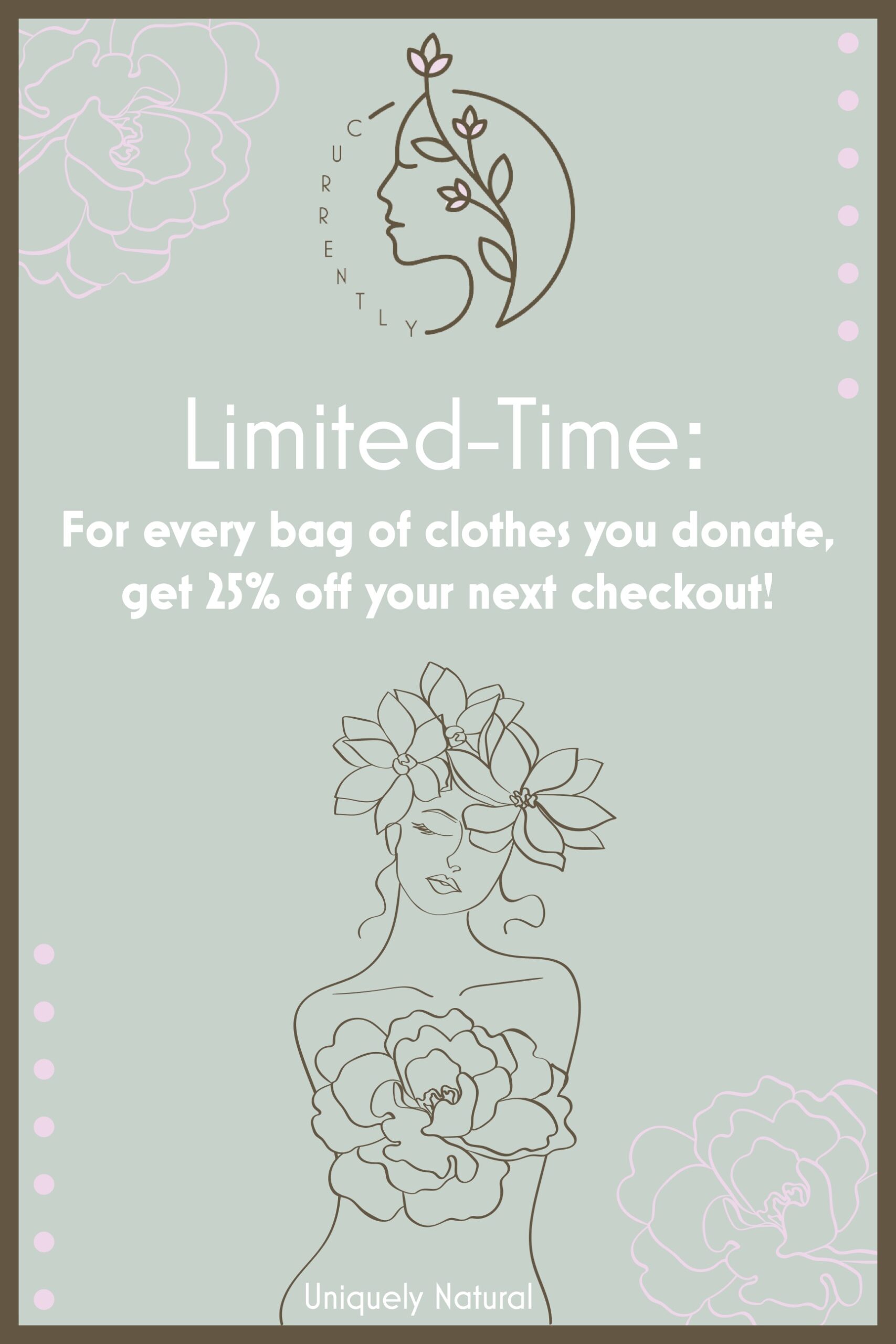
  1. Resourceful: All processes of design and manufacturing are completed in a sustainable manner.
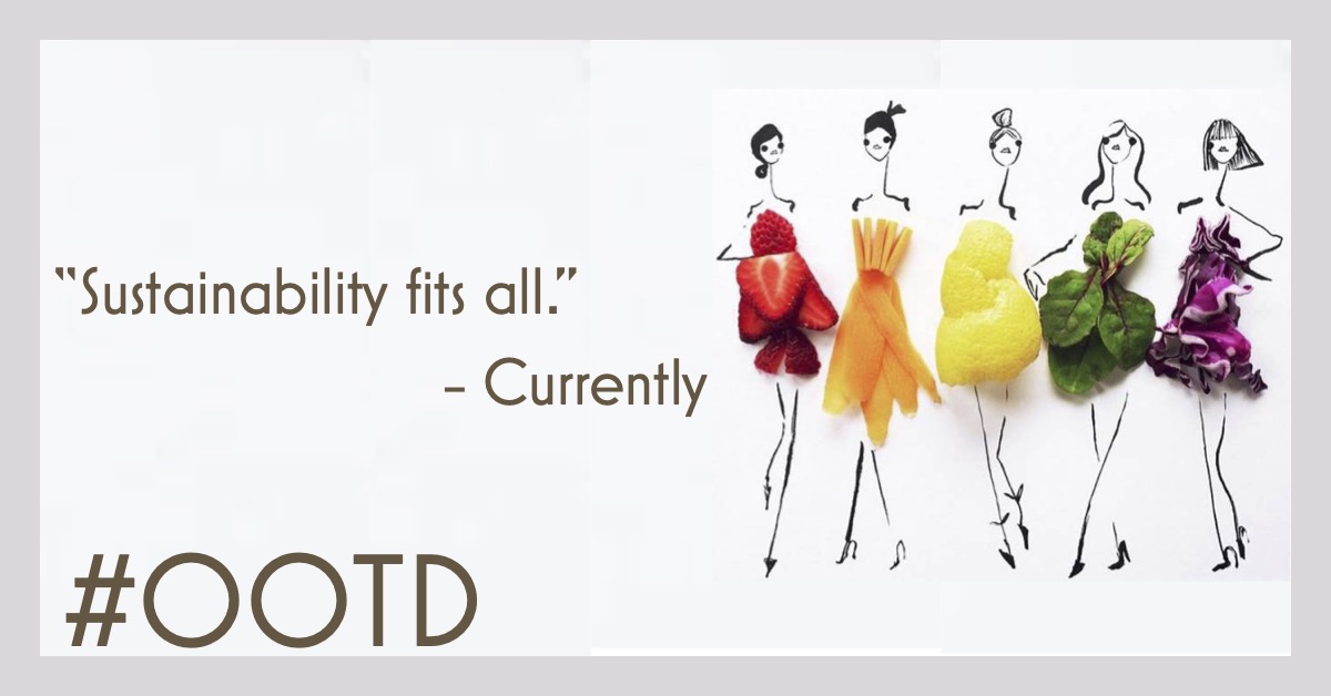
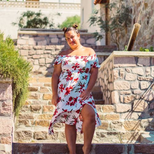
  2. Open-minded: Currently offers an inclusive range of sizes, so everyone can take part in our fashions.
  3. Pioneering: Currently hopes to inspire the fashion industry to become more eco-friendly and inclusive.
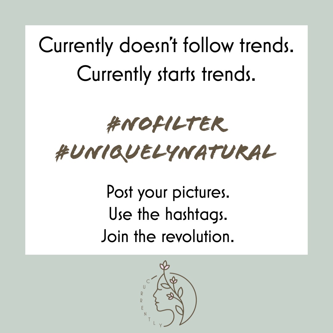
  4. Imaginative: All of our designs are unique, we don’t follow trends. Rather they are based on classical styles with a modern twist.
  5. Versatile: All of our pieces can be dressed up or dressed down and worn for a variety of occasions.
Logo
The style of my logo is a combination of earthy and whimsical. I chose to design it in this way because one of the selling points of the Currently brand is how the clothing is designed, manufactured, and sold within an environmentally-conscious manner. As a result, I wanted to clearly communicate that aspect through the logo with earthy elements. Next, I wanted the logo to portray whimsical elements as another selling-point of the brand is its inclusivity. The wide-range of sizes is unique for fashion brands and I wanted to show how the Currently brand is unique and does not follow the strict and outdated rules of fashion.

The basis of the logo is graphic which serves as the logomark. The final design consists of a line drawing of the side profile view of a woman’s face. Alongside the face is a flowery vine/branch. This graphic is placed within a circle, which serves as a frame for the logo. This imagery was chosen because the circle is reminiscent of the recycling emblem (which is made up of three arrows in a circular shape). I wanted to include a visual representation of sustainability within the logo since that aspect is an integral part of the Currently brand. In addition, natural forms are also found throughout our branding since they are a nod to our nature-focused brand. Next, the woman’s face serves to inform viewers/consumers who the target audience of the clothing brand is. Finally, the flowery vine/branch is another representation of how this brand is eco-friendly and incorporates natural materials (such as leather made from fruit) to create vegan clothing.

The color palette is made up primarily by a dark coffee brown. There are accent colors of a light tan (called timberwolf) and a pastel pink (called pink lace) for the flowers and a muted green (called ash gray) for the leaves. The logo is set against a plain white background for a clean and simple look that allows the colors to pop against the contrast of the background. I chose these colors due to their resemblance of earthy and natural tones. Ultimately, I chose to make the dominant color brown because that is an abundant color in nature. The lighter colors (including tan, pink, and green) give this logo a feminine quality, which would attract the attention of potential consumers of the target audience.

Regarding the typography, I chose to use the Mostra Nuova font. I chose this font because it is a clean and simple sans-serif font that has high readability and contrasts the whimsical graphic. The font is quite geometric and has art deco qualities to it. With these qualities, the geometricness plays into the usage of the circle (another geometric shape) of the frame, while contrasting the free-flowing elements of nature with the branch. The font is arranged within this way because I wanted to integrate the wordmark within the graphic. I believe the placement of the brand name within the logo design connects the two elements in a harmonious fashion. Additionally, I chose to type out the name Currently in all capital letters since I wanted a uniform look where all the letters were the same height and width. Importantly, I did not want the last letter ‘y’ to break the frame since it would drop below the baseline of the word. Finally, I increased the kerning between the letters of the word to increase readability and place an emphasis on the curve of the word.
The Advertisements
Developed user personas based on the target demographics for the brand. Currently’s key demographics are younger women (ages 18 - 40) who are open-minded and self-proclaimed changemakers. While everyone is welcome to buy and wear Currently’s clothes, we will find that our key clients will fall within this demographic since women of ages 18 - 40 tend to hold these ideals that align with our company’s values and practices. One user is a lawyer who advocates for minority groups. Given their platform, they use their voice to speak out against inequality and strive to be a voice for change. when they are not busy working on a court case, are getting outside and helping those in their community through local volunteer opportunities. At least once a week, they strive to volunteer at least once with a local organization in order to get involved with those around them and make their lives a bit better in any way they can. Currently also has an interest for fashion, so they take time during the weekends to go thrift shopping and look for cool finds. They use the pieces and upcycle them using their sewing machine and extra material to make a completely unique piece.

The advertisements were created for both social media and out-of-home (particularly billboards). Given the high frequency of ages 18-40 living in populated urban areas and frequently using social media platforms, I designed advertisements that would meet the users where they are.

Fin.

Explore more projects by returning to the "My Work" page.

Selected Works

Currently CampaignIntegrated Media Campaign

Vans CampaignIntegrated Media Campaign

Betty Crocker CampaignIntegrated Media Campaign

Ablaze Magazine CampaignIntegrated Media Campaign

Indeed CampaignIntegrated Media Campaign

Kiwi Mouse Records LogoGraphic Design

Ablaze Magazine LogoGraphic Design

Thanksgiving FashionSocial Media

Coronation FashionSocial Media

Futuristic Fashion ShootPhotography & Videography

Pieces of the World CollagePhotography & Videography

Up-and-Coming Journalist ProfilePhotography & Videography