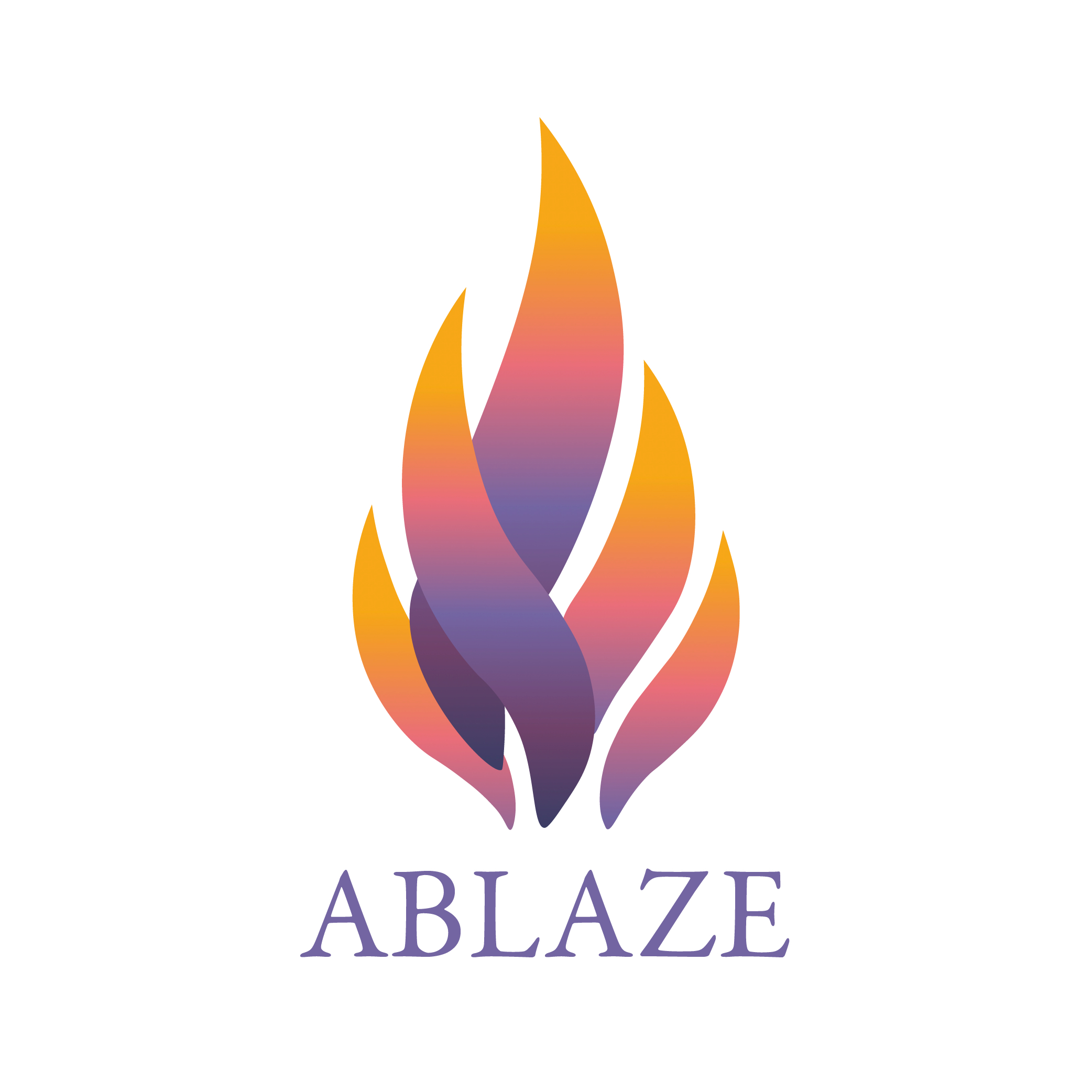
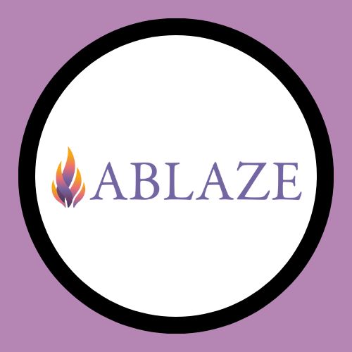
Ablaze Magazine's Logo
Part of the Graphic Design Collection

Introduction:
I created a logo for the student-run college magazine, Ablaze. With the name serving as a source of inspiration, I sought to develop a logo that would capture the essence of the brand and make a lasting impact.
- The Logo -
My Work:
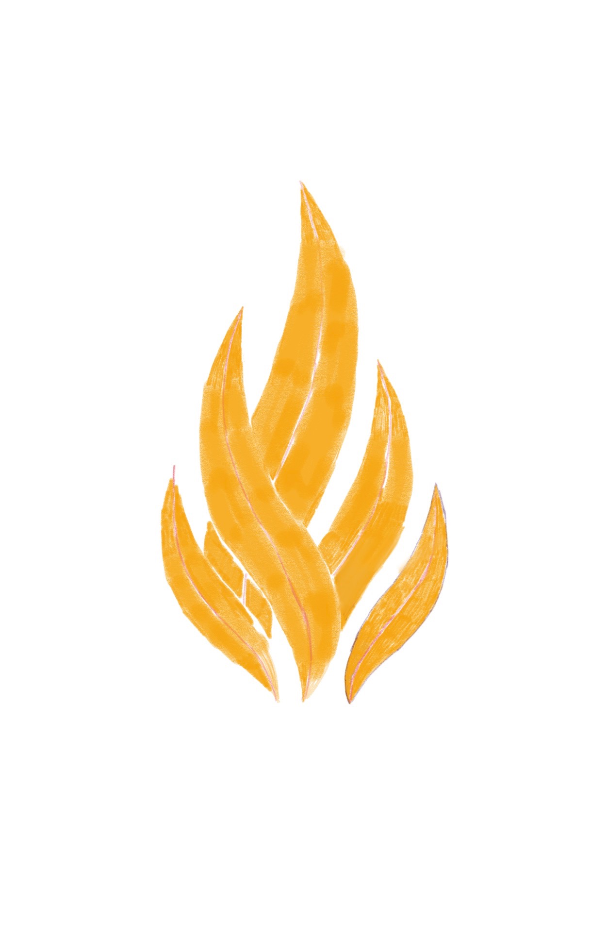
The logo design process began with a series of thumbnail sketches, exploring various visual representations of fire, matches, and sparks. Through careful consideration and iterations, it became apparent that simplicity and effectiveness were key. The concept of a flame stood out as a powerful symbol that aligned perfectly with the magazine's name and identity.
- Thumbnail Sketches -
Extensive discussions and feedback sessions ensued, delving into seemingly trivial details such as the shape of the flame's corners (square, beveled, or rounded) and the direction of the gradient. These seemingly small decisions played a crucial role in defining the overall look and feel of the logo. Countless sketchbook pages and pencils were utilized to refine the design until a group-wide consensus was reached.


Brainstorming
When approaching the design of the logo, I initiated a thorough brainstorming process that involved meticulously curating a collection of images, extracting inspiration from various sources, and delving into the core essence of the brand to craft a logo that embodies its unique identity and resonates with its target audience.
The final logo design features a representation of fire composed of five distinct flames. Each flame symbolizes an integral stakeholder in the magazine's success, including the university, the College of Communication and Information, the Office of Student Media, the Knoxville community, and the dedicated members and contributors of Ablaze.
Once the design concept was solidified, it was translated into a digital format using Adobe Illustrator. This allowed for precise detailing and ensured that the logo could be transformed into a versatile vector graphic. To accommodate various applications and scenarios, different versions of the logo were created, including full-color, black and white, and monochrome variations.
The complete logo consists of both a logotype and a logomark, offering flexibility in its usage across different mediums and platforms. Additionally, separate renditions of the logo were produced to cater to future needs and potential adaptations.
The resulting Ablaze logo represents the magazine's vibrant spirit, passion, and its close connection with multiple stakeholders. Its dynamic design and thoughtful execution make it a powerful visual identifier that reinforces the brand's identity and captures attention.
Through careful consideration of every detail and an unwavering commitment to the magazine's vision, the Ablaze logo serves as a strong foundation for the brand's visual identity and will effectively represent the magazine across various contexts and platforms.
Selected Works

Currently CampaignIntegrated Media Campaign

Vans CampaignIntegrated Media Campaign
Betty Crocker CampaignIntegrated Media Campaign
Ablaze Magazine CampaignIntegrated Media Campaign

Indeed CampaignIntegrated Media Campaign

Kiwi Mouse Records LogoGraphic Design
Ablaze Magazine LogoGraphic Design

Resort & Cruise Haute CoutureSocial Media

Thanksgiving FashionSocial Media

How to Shop & Style Petite FashionSocial Media

Coronation FashionSocial Media

The Stylists Behind Celeb FashionSocial Media

French Food in KnoxvilleWriting

Letter From The EditorWriting


Futuristic Fashion ShootPhotography & Videography

Pieces of the World CollagePhotography & Videography

Up-and-Coming Journalist ProfilePhotography & Videography
Disney+ Situation AnalysisResearch

Disney+ Final BookResearch