Ablaze Magazine Campaign
Part of the Integrated Media Collection
Introduction:
In the fast-paced world of student publications and the general media landscape, maintaining relevance and adaptability is essential for long-term success. However, Honey Magazine, a beloved student-run college publication, has faced significant challenges in recent times. From internal and external transitions of power, to changes in leadership, and a struggle to find its new purpose within the community, both in the Knoxville area and on the University of Tennessee, Knoxville (UTK) campus, the magazine has reached a critical juncture. Recognizing the need for revitalization, we embarked on an ambitious rebranding campaign to ensure the magazine's survival and regain its prominence within the collegiate community.
An Outline of the Campaign:
Our rebranding campaign for Honey Magazine is designed to reestablish its presence and reconnect with its audience by embracing its unique strengths, fostering community engagement, and crafting compelling content that resonates with diverse readership.
Here's an outline of our approach:
Through our comprehensive rebranding campaign, we committed to revitalizing Honey Magazine and positioning it as a valued student-run college publication at The University of Tennessee, Knoxville. By rediscovering its identity, crafting compelling content, fostering community engagement, and leveraging digital platforms, we reignited the magazine's relevance, strengthened its readership, and solidified its role as a powerful voice within the UTK community. Together, we embarked on an exciting journey to reshape the magazine's future and create a platform that inspires, informs, and connects students, both on and off campus.
- Project Contents -


My Work:
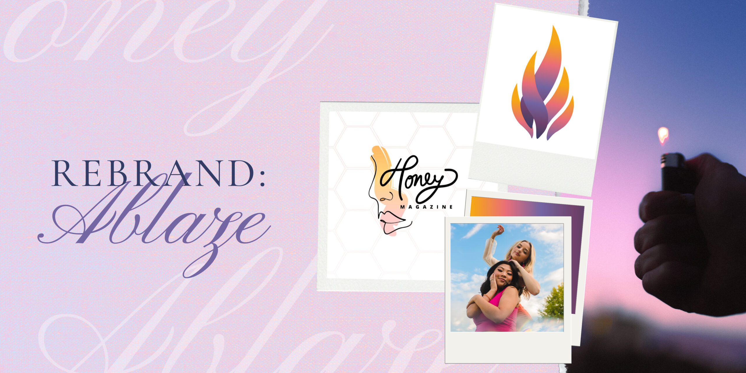
I embarked on a transformative rebranding campaign to rejuvenate Honey Magazine, a beloved student-run college publication. Recognizing the need for change, our mission was to revitalize the magazine, redefine its purpose, and reignite its connection with the UTK community. Guided by a deep understanding of the challenges Honey Magazine faced, we set out to create a rebrand campaign that would breathe new life into the publication.
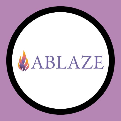
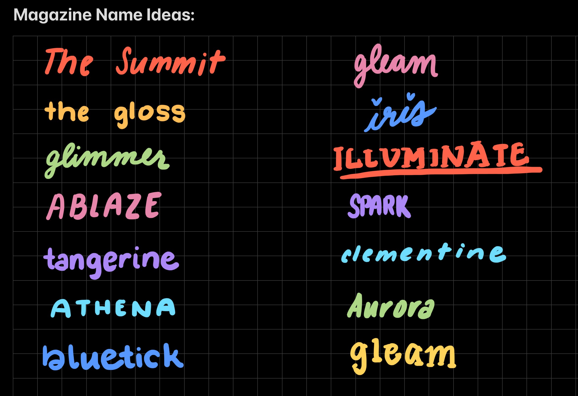
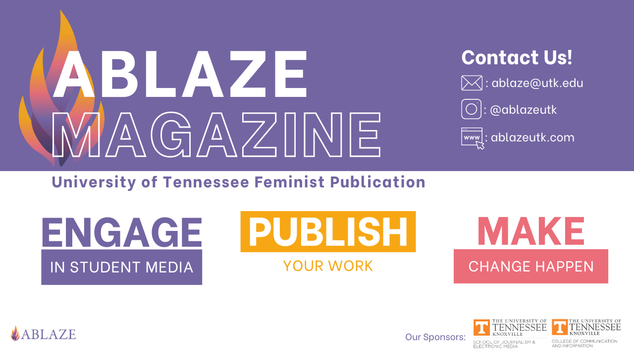
Our first step was to rename the magazine, and after careful consideration, we chose the name "Ablaze." This name resonates with other student media organizations, the university itself, and embodies the passion and energy that fuel the magazine's content, all while maintaining a connection to its roots.
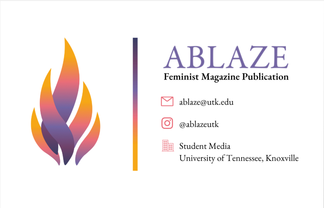
To complement the new name, we designed a striking logo mark—a flame in a gradient of vibrant colors. The spectrum of orange, yellow, pink, purple, and blue captures the essence of a real fire, symbolizing the magazine's dynamic and diverse content. This logo serves as a visual representation of the magazine's renewed spirit and commitment to its readership.
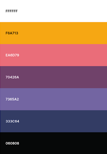
Building on Honey Magazine's legacy as a feminist women's publication, we preserved the essence of its core values while infusing it with a modern and fresh approach. The color palette draws inspiration from the colors of real fire, incorporating warm and captivating hues that evoke passion, energy, and empowerment. This streamlined palette enhances the visual cohesion of the brand and establishes a strong and consistent visual identity.
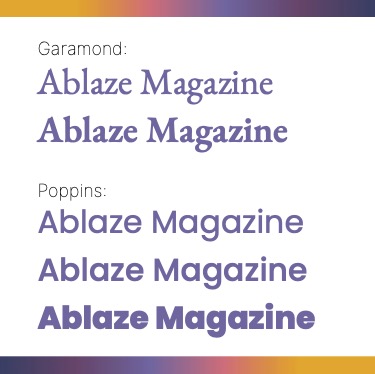
Typography played a crucial role in reflecting the magazine's evolution. We selected a combination of Garamond and Poppins fonts. Garamond, a classic serif font, was chosen for titles and body copy, paying homage to the magazine's history and adding a touch of elegance. Poppins, a contemporary and versatile sans-serif font, was used for headings, representing the magazine's forward-thinking mindset and bright future.
To ensure consistency and coherence across all brand touchpoints, we developed a comprehensive style guide. This guide outlined the visual elements, typography, color usage, and brand guidelines, providing a blueprint for maintaining a cohesive and professional brand identity.
Not only did we transform the magazine's visual identity, but we also reimagined its functionality. Drawing inspiration from real-life magazine outlets and industry best practices, we revamped the layout and design of the publication. The result is a more professional and engaging magazine, with improved readability, captivating visuals, and seamless integration of content.
This rebranding campaign is part of an overarching advertising strategy that addresses the pitfalls Honey Magazine faced. By aligning the brand with its target audience, redefining its purpose, and revitalizing its visual identity, we aim to create a powerful connection with the UTK community. Through our collective efforts, we are confident that Ablaze Magazine will rise as a leading voice, inspiring and empowering readers with its compelling content and unwavering dedication to journalistic excellence.
The Breakdown of My Work:
With this project, I developed a complete style guide including a color palette, typography, slogan, tone of voice, brand values, and a logo. Upon curating branding guidelines, I created several digital advertisements based on the rebrand.
- Passion: Ablaze Magazine is fueled by a genuine passion for its subject matter and a commitment to delivering compelling and inspiring content to its readers.
- Empowerment: Empowerment lies at the core of Ablaze Magazine's mission, aiming to uplift and empower individuals by providing them with a platform to share their stories, experiences, and perspectives. The magazine strives to create a supportive and inclusive community where all voices are heard and celebrated.
- Diversity: Diversity is another crucial value for Ablaze Magazine. It recognizes and embraces the beauty of diverse backgrounds, cultures, and identities. By amplifying diverse voices and showcasing a wide range of perspectives, Ablaze Magazine fosters understanding, empathy, and unity among its readers.
- Authenticity: Authenticity is highly valued by Ablaze Magazine. It seeks to present genuine and relatable content that resonates with its audience. By staying true to its core values and maintaining a transparent and honest approach, the magazine establishes trust and credibility with its readers.
- Creativity: Creativity is at the heart of Ablaze Magazine's brand. It encourages and celebrates creativity in all its forms, whether it's through innovative storytelling, unique visual aesthetics, or thought-provoking features. Ablaze Magazine aims to inspire its readers to explore their own creativity and embrace their passions.
Selected Works

Currently CampaignIntegrated Media Campaign

Vans CampaignIntegrated Media Campaign
Betty Crocker CampaignIntegrated Media Campaign
Ablaze Magazine CampaignIntegrated Media Campaign

Indeed CampaignIntegrated Media Campaign

Kiwi Mouse Records LogoGraphic Design

Ablaze Magazine LogoGraphic Design

Resort & Cruise Haute CoutureSocial Media

Thanksgiving FashionSocial Media

How to Shop & Style Petite FashionSocial Media

Coronation FashionSocial Media

The Stylists Behind Celeb FashionSocial Media

French Food in KnoxvilleWriting

Letter From The EditorWriting


Futuristic Fashion ShootPhotography & Videography

Pieces of the World CollagePhotography & Videography

Up-and-Coming Journalist ProfilePhotography & Videography

Disney+ Situation AnalysisResearch

Disney+ Final BookResearch